

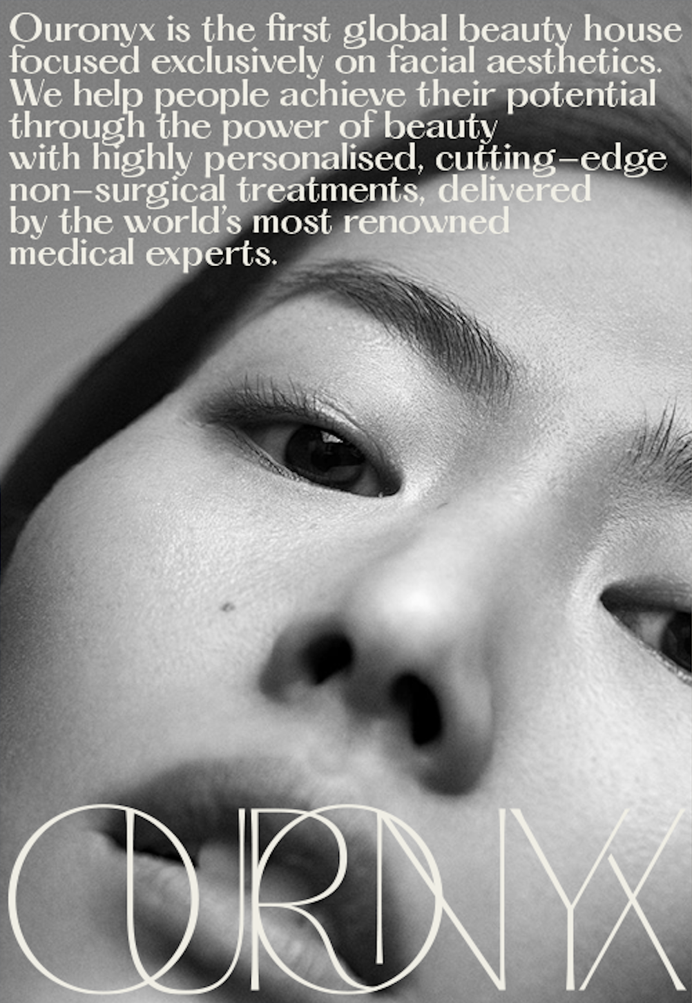
What if beauty clinics didn’t feel like clinics? We created a brand world that whispered sophistication, not status—less clinical, more curatorial. From the name to the welcome tray, every detail was designed to convey calm confidence and modern luxury.

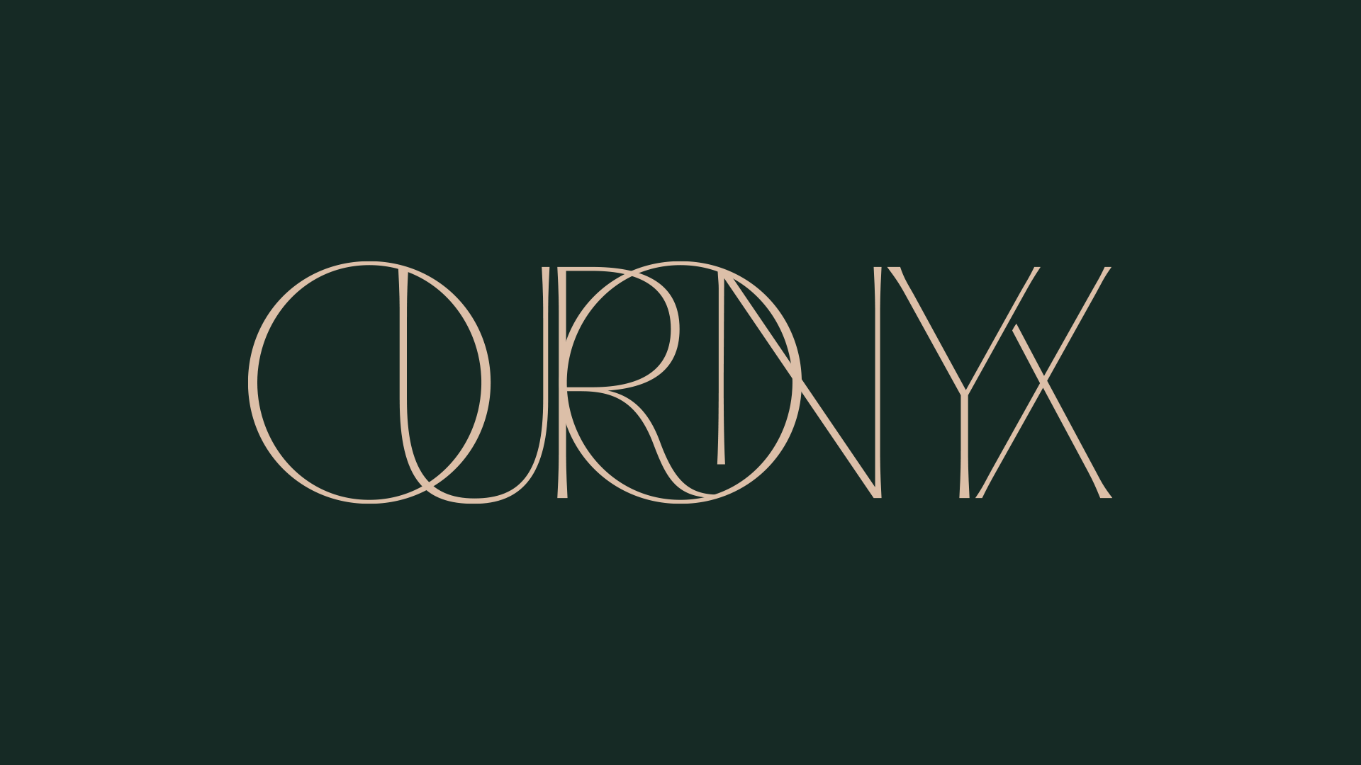
The name ‘Ouronyx’ blended Ouro (public self) and Onyx (private self)—a word that felt ancient, precious, and quietly powerful.
The brand identity was minimal, sculptural, and symmetrical, drawing inspiration from the Golden Ratio to evoke natural, balanced beauty. The tone was composed, more Vogue than vanity—luxury held lightly, speaking to those who curate their world quietly, with taste and intention.


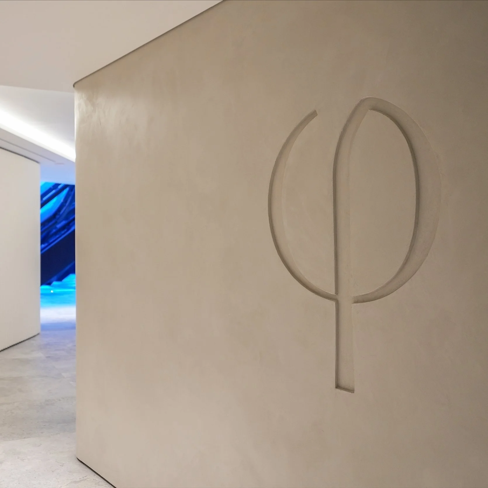
The Ouronyx brand mark draws from the ancient symbol of Phi, the Golden Ratio—a mathematical proportion found in nature, art, and the human form. Representing harmony, symmetry, and timeless beauty, the Phi mark becomes an emblem of the brand’s ethos: precision balanced with softness, science enhanced by style.


I created the Ouronyx brand look and feel, then worked closely with the founders to translate it into a physical space—providing moodboards, textural studies, and creative direction that could be taken directly to their architects. The result was a flagship destination where stone finishes, gallery lighting, and soundproof rooms transformed clinical precision into a sanctuary of modern beauty.