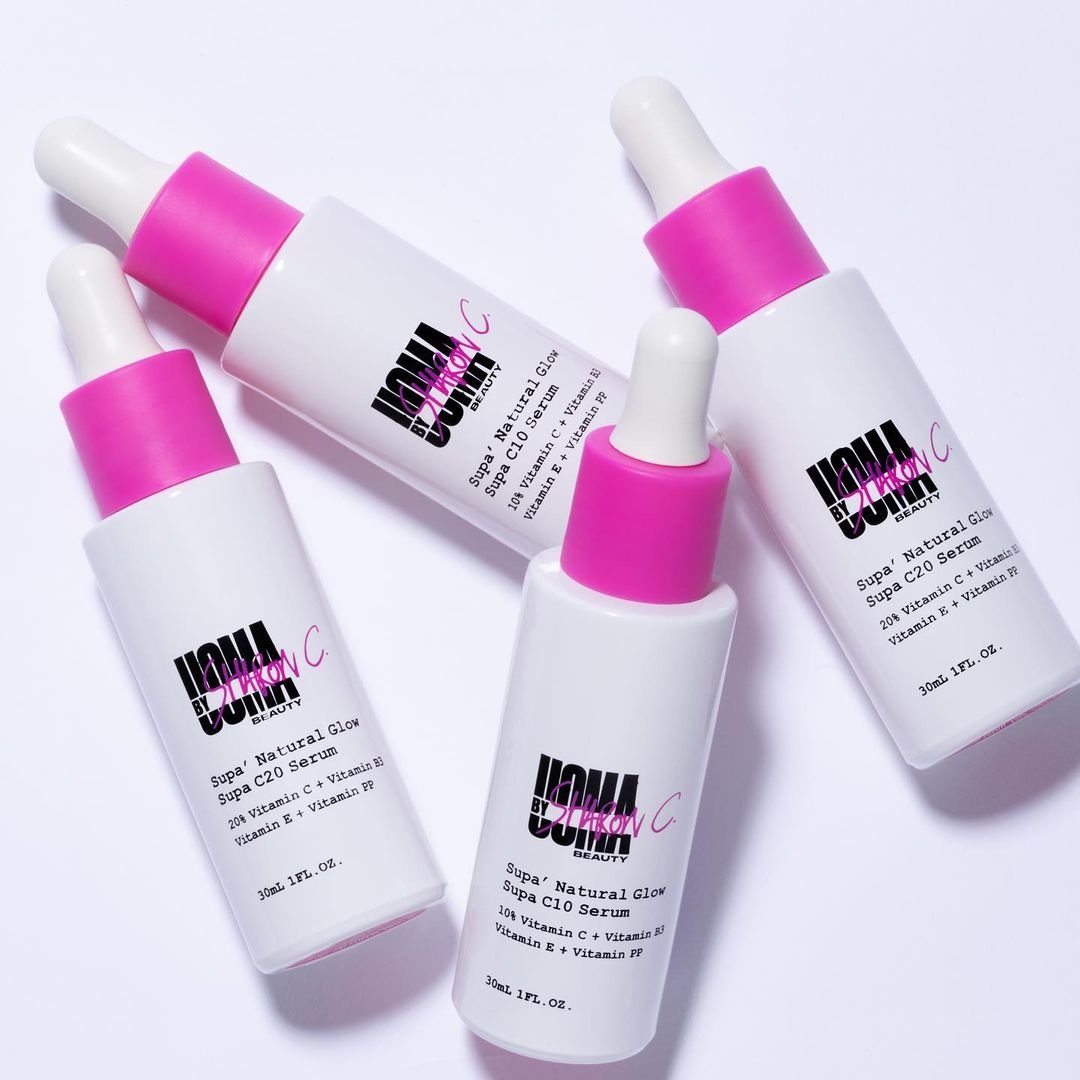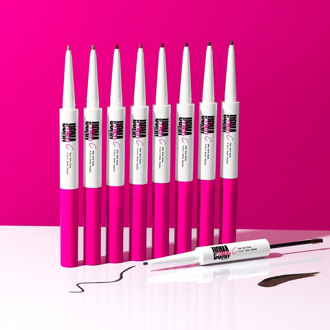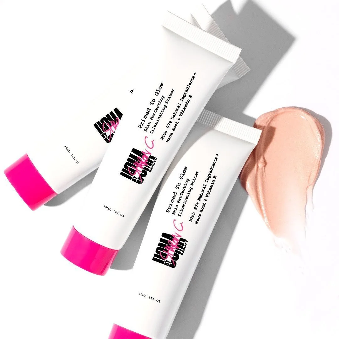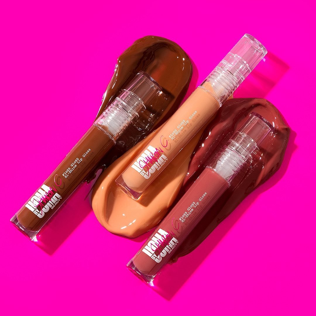

Uoma by Sharon C
Loud. Joyful. Built to disrupt.
What Happens when a beauty brand refuses to behave?
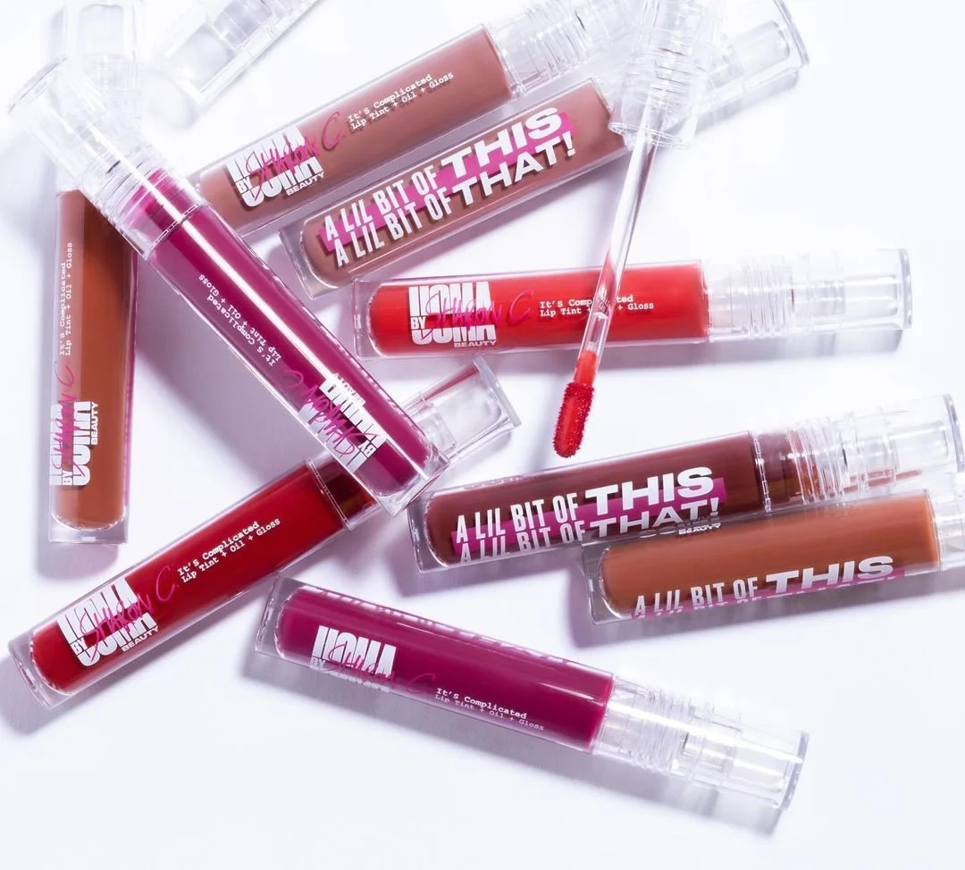
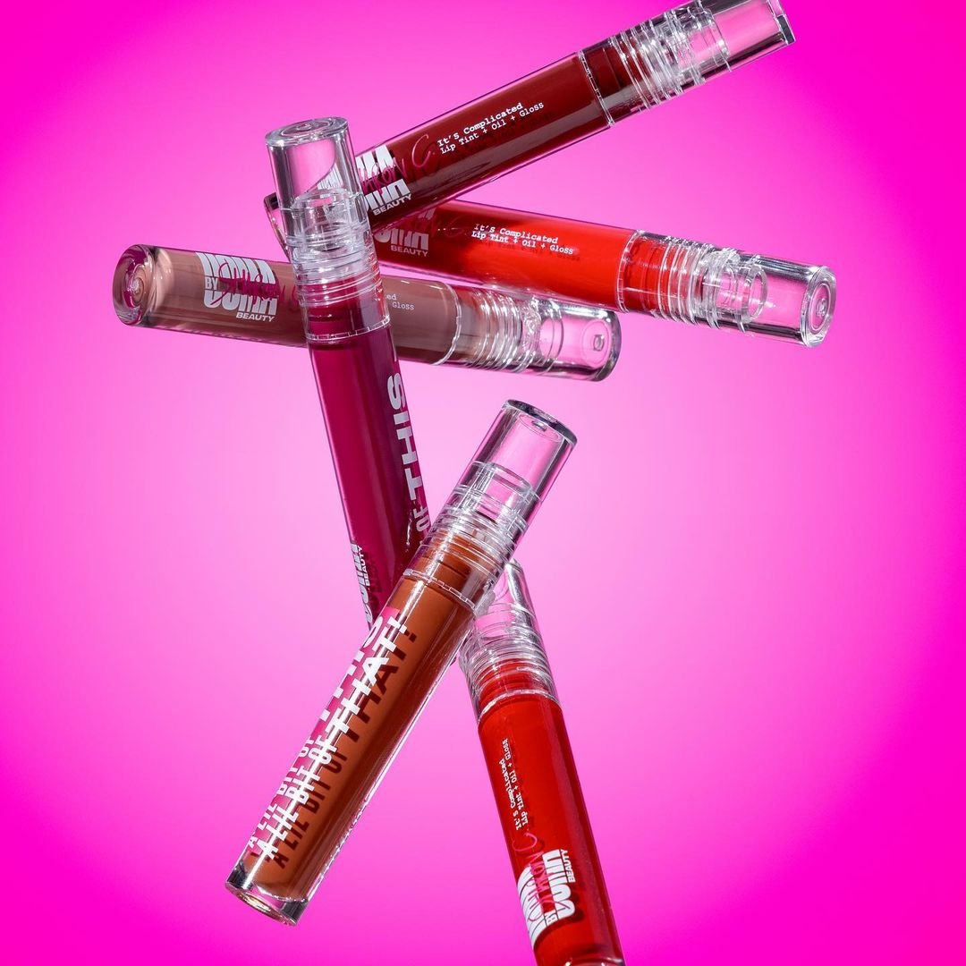
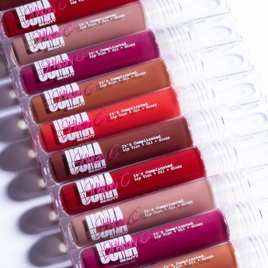
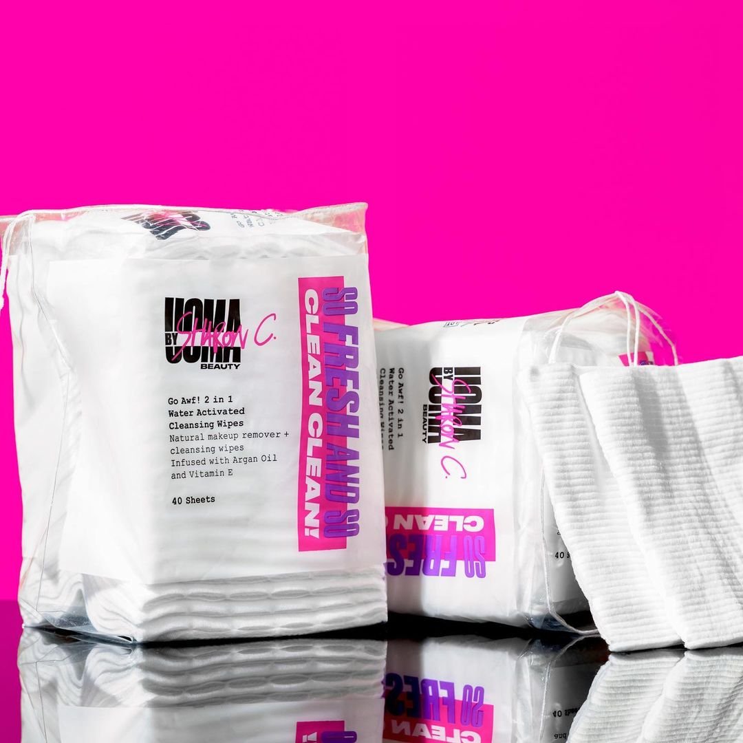
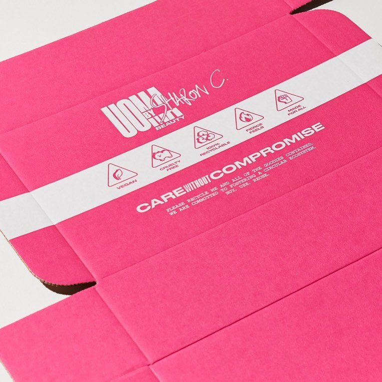
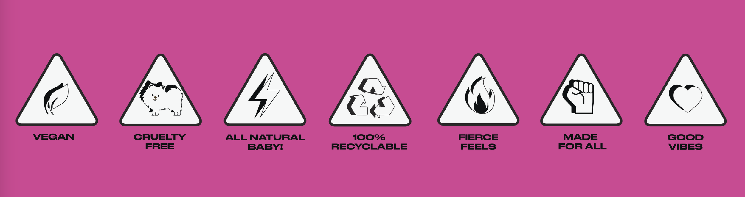
This wasn’t a diffusion line. It was a pop-culture intervention. We built UOMA by Sharon C around radical affordability, meme logic, and real-world joy — backed by the original founder’s unapologetic spirit.
As the rebellious younger sister to UOMA Beauty, UOMA by Sharon C was made to shake things up.
Role: Art Director (Spring Studios)
Client: UOMA by Sharon C, founded by Sharon Chuter
Deliverables: Brand identity · Campaign voice · Naming · Messaging
Platforms: DTC, Retail, Social, Web, Packaging
Result: Distinct new brand launched from scratch, with a bold tone and instantly recognisable voice
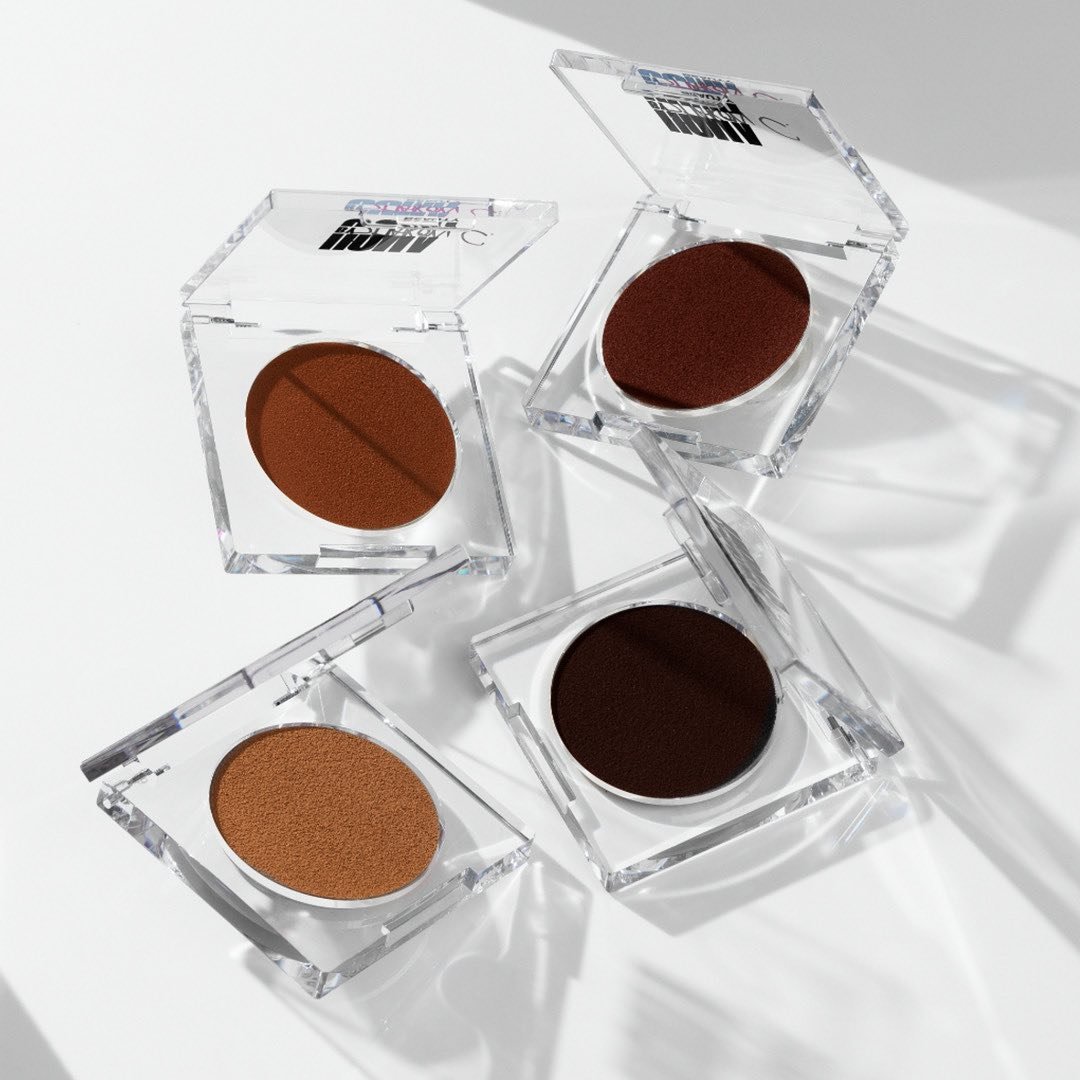
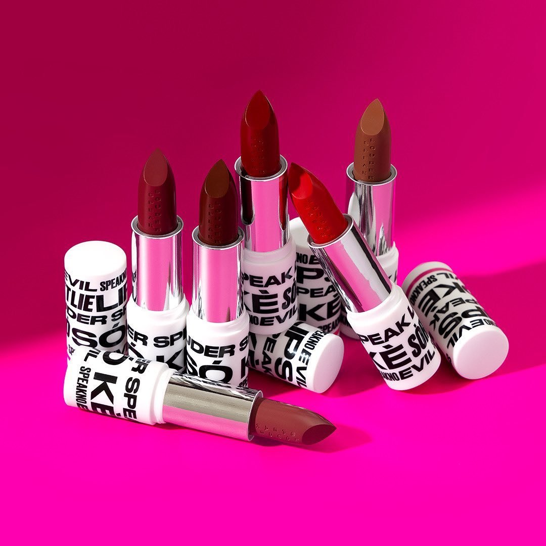
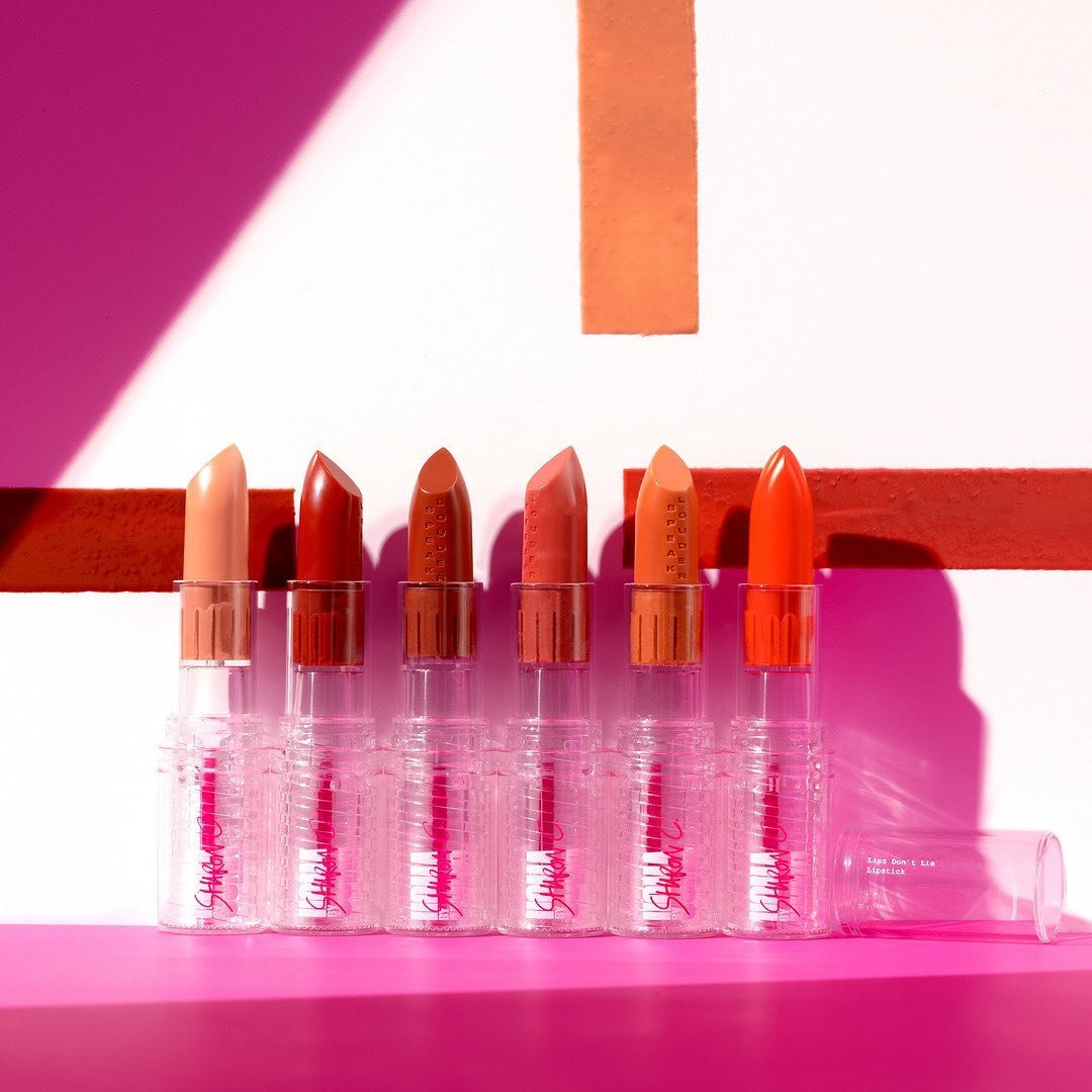
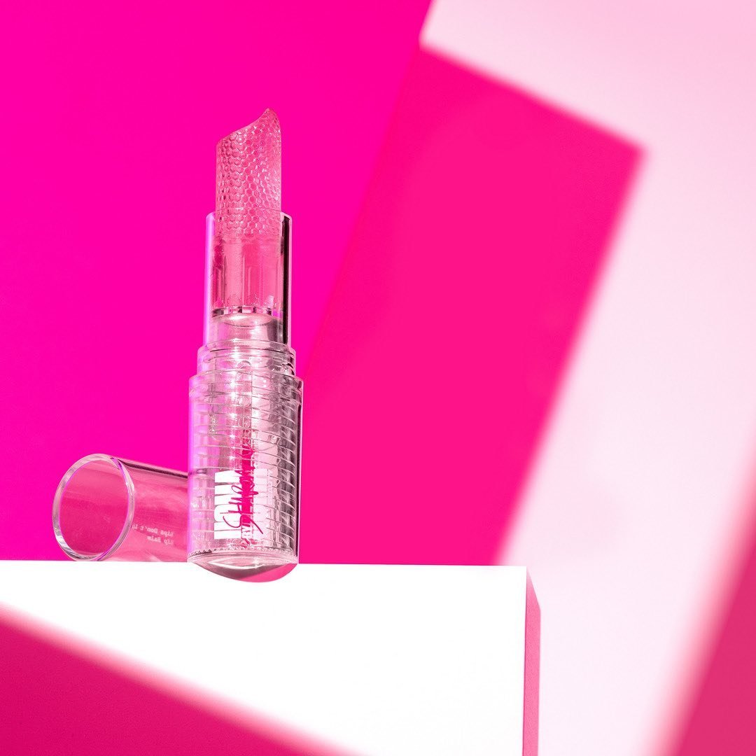
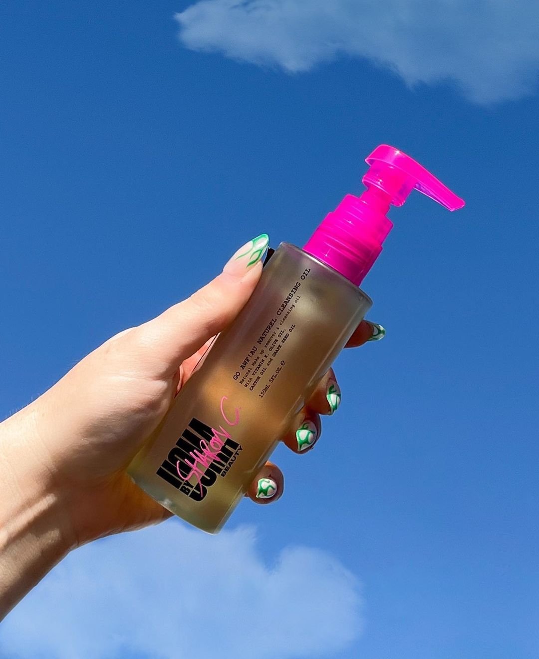
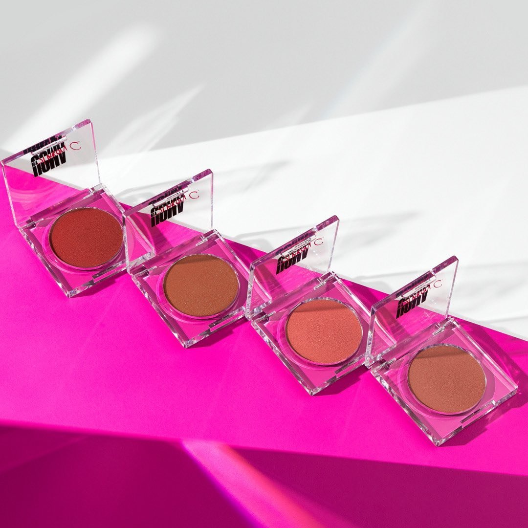
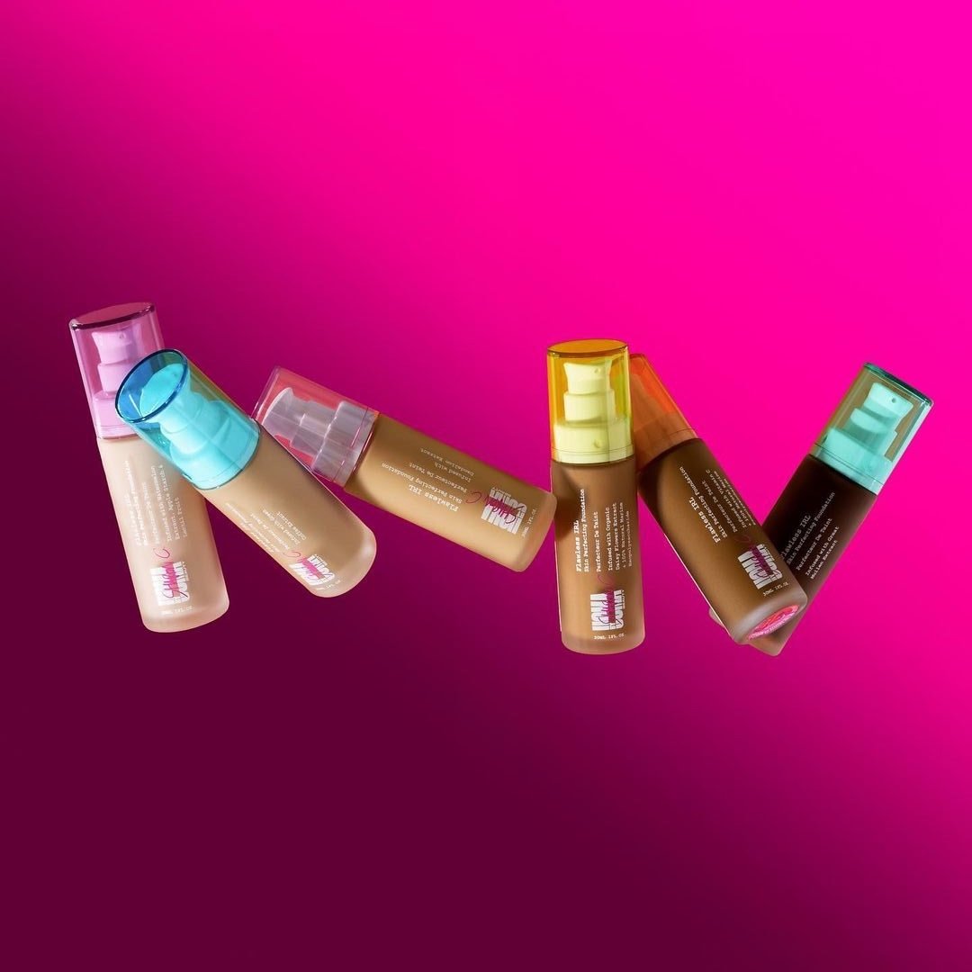
The Identity
From name to tone to visual system, we created a full brand platform designed for noise. This wasn’t a muted clean-girl aesthetic — it was textured, defiant, and joyfully loud. A reflection of the cultural mess Gen Z was navigating with humour and pride.
The Voice
We wrote a tone that felt like texting your boldest friend. Irreverent, values-driven, and totally free of corporate polish. Every line of copy was designed to feel empowering *and* scrollable — a brand that clapped back and cheered you on.