olivia palermo
Branding Beauty With Texture. A visual identity rooted in style, material, and touch.
What happens when you brand someone who already is a brand?
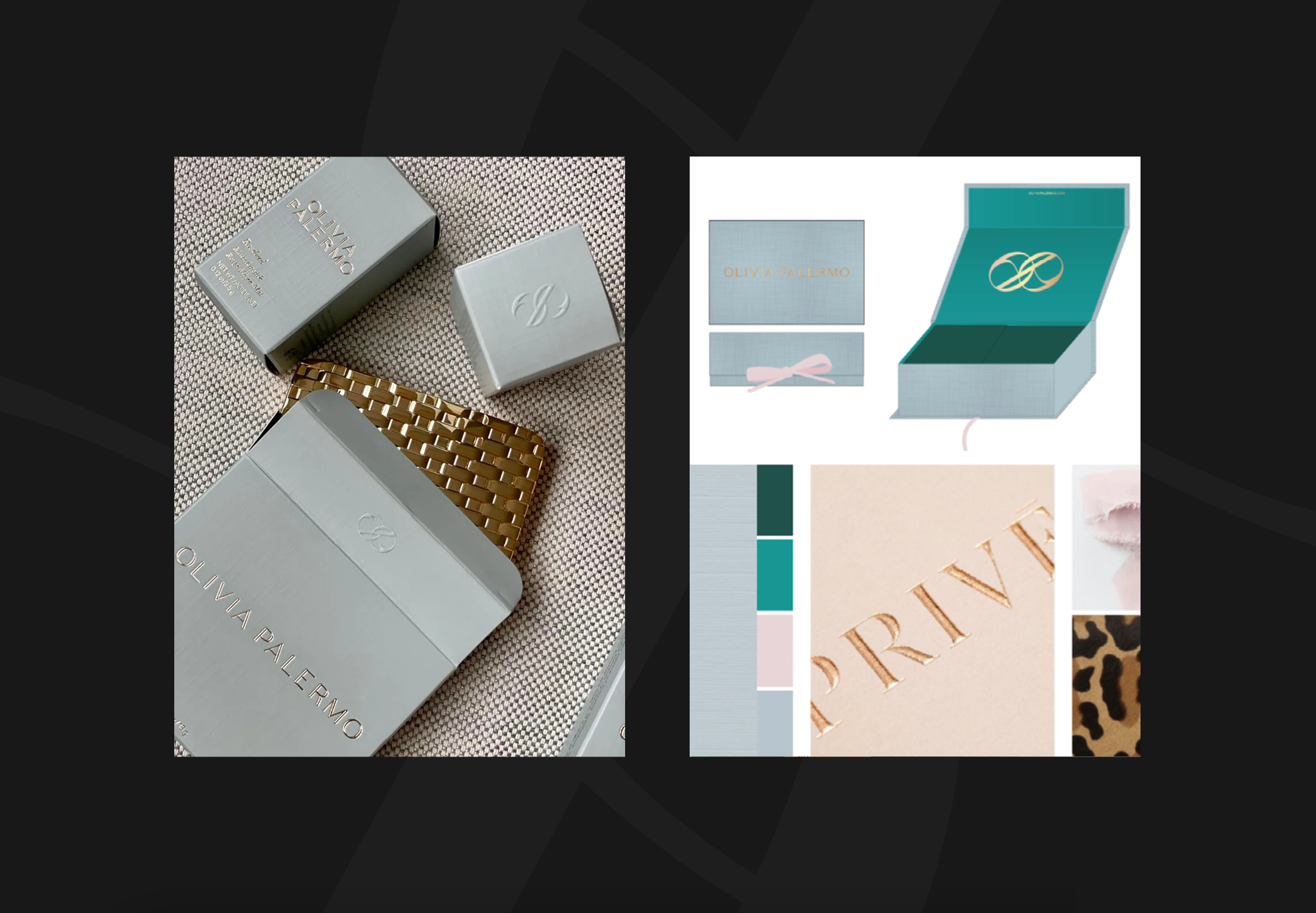
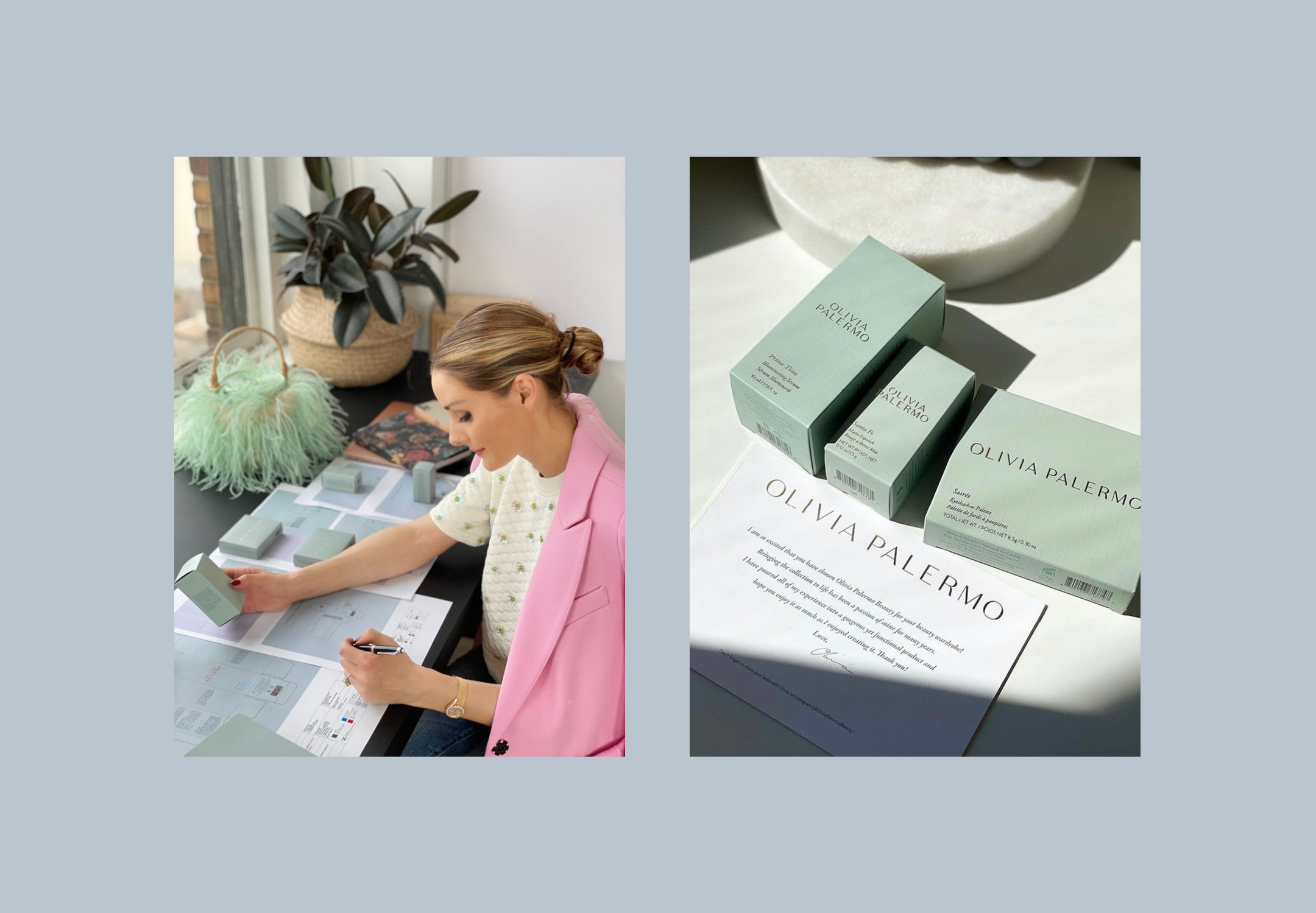
We took Olivia’s distinct taste and translated it into a system that could scale. From the weight of a lipstick to the grain of a card stock, every detail was considered, not just styled. This was luxury with memory.
Role: Brand Designer + Art Director (Spring Studios)
Deliverables: Brand identity · Packaging design framework · Tone of voice concepting · Brand guidelines
Focus: Physical and digital cohesion
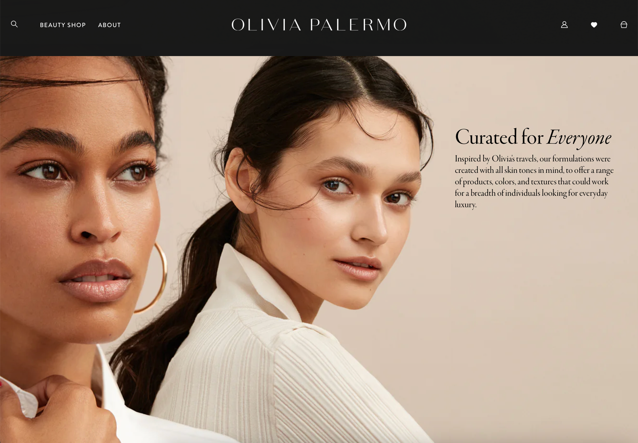
Result: Distinct, recognisable brand with a cross-category aesthetic system
The FOUNDATIONS
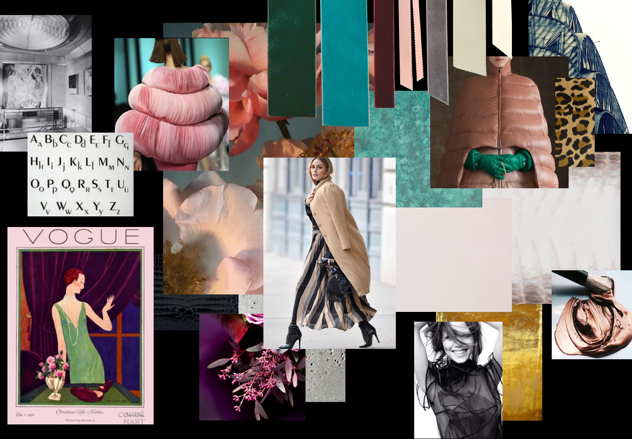
We began not with a moodboard, but with materials. Fabric swatches, vintage ribbon, marble textures, and gold leaf finishes guided our direction. It was a design-first process, grounded in Olivia’s personal archives and fashion references.

The brand system
The identity combined Deco geometry with New York modernism — symmetry, repetition, and deliberate restraint. Typography was refined but never sterile, and the colour palette pulled from Olivia’s world: bronze, alabaster, noir, and soft rose.

THE EVOLUTION
The identity successfully: Launched lifestyle brand (2020) • Expanded into beauty • Informed product design • Guided packaging development • Created retail presence • Established brand world


WHY IT WORKED
Success came from understanding: Style transcends category • Physical informs digital • Details define luxury • Heritage inspires future • Personal becomes universal

